Hello World, part five
This part changes how every control looks, in one place: the theme. You open the theme, find the colours of a button, and add your own CSS class. It assumes that you have done the earlier parts, in particular part four.
In this part you will:
- Find your way around the theme editor
- Change the colours of the primary button for the whole application
- Add your own CSS class and use it on a form
Open the theme
In the Project Explorer, open Themes, then the folder Angular Theme, then LightTheme. The editor has tabs at the bottom: Theme, Variations, Components, Icons, Resources, Packages, Theme LESS Code and User LESS Code. The Theme tab has two parts, Variables and Responsive, and it starts with the colour palette: the colours stone, neutral, zinc, gray and more, each in shades from 50 to 950.
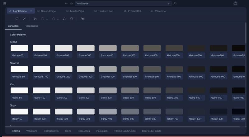
The theme editor is described in full in Theme.
Change the colour of a button
Open Components, expand Form and select Button. You see its Variations (Standard, and Add... for your own), the Variation Options (Default Color Role, Default Size Role), and the Roles: Global, Primary, Info, Success, Warning, Danger, Default and the sizes XS, S, M, L and XL.
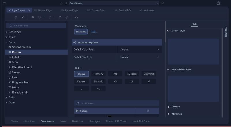
Select the role Primary. Its colours are variables: BackgroundColor is @color-primary (indigo-600), ForegroundColor is @color-primary-contrast (indigo-50) and HoverBackgroundColor is @color-primary-hover (indigo-800). Each row has icons to override the value (the pencil), to clear it, to copy it and to paste it. A globe icon marks a value that is taken from a global variable.
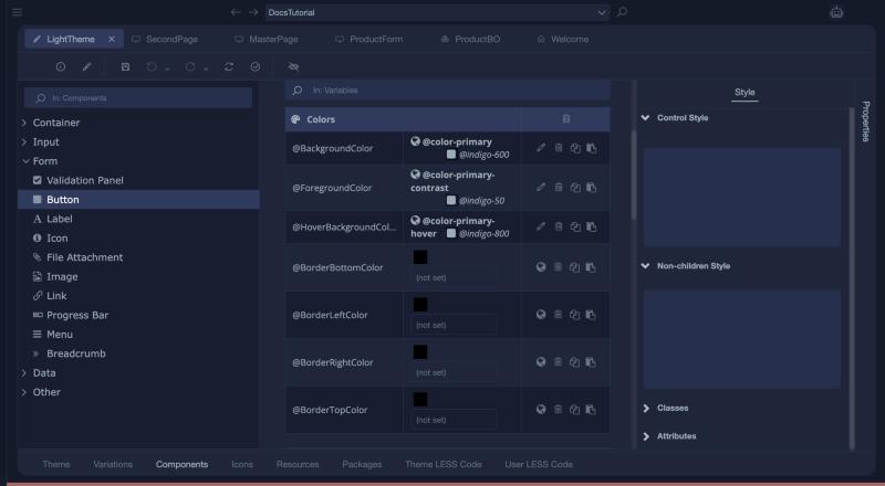
To use another colour for every primary button:
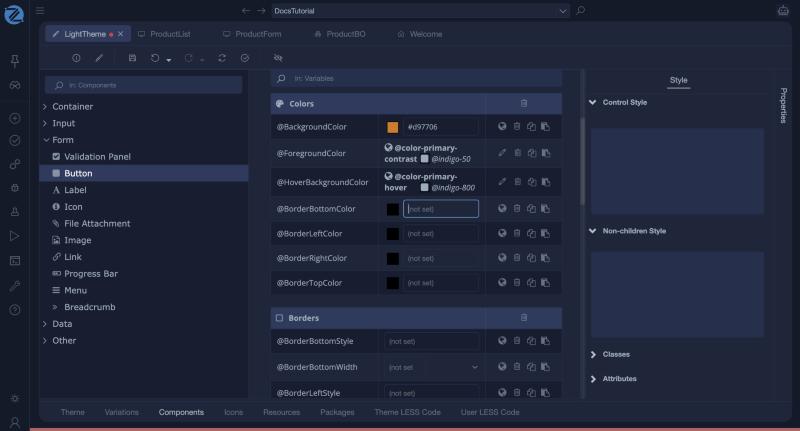
- Click the pencil (Override Value) of BackgroundColor. The row now shows the global variable it pointed to,
@indigo-600. - Click the pencil a second time. The row becomes an editable colour, empty at first, with a colour swatch and a text box.
- Type a colour, for example
#d97706, and press Tab. The swatch changes. - Save the theme, then build the application.
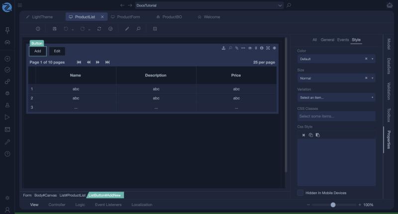
The theme only affects the buttons that use the Primary role. A new button has the role Default. To use Primary, select the button, open Properties, go to the Style tab and choose Primary in Color, which also offers None, Success, Info, Warning, Danger and Default.
After the build, that button is orange in the running application:
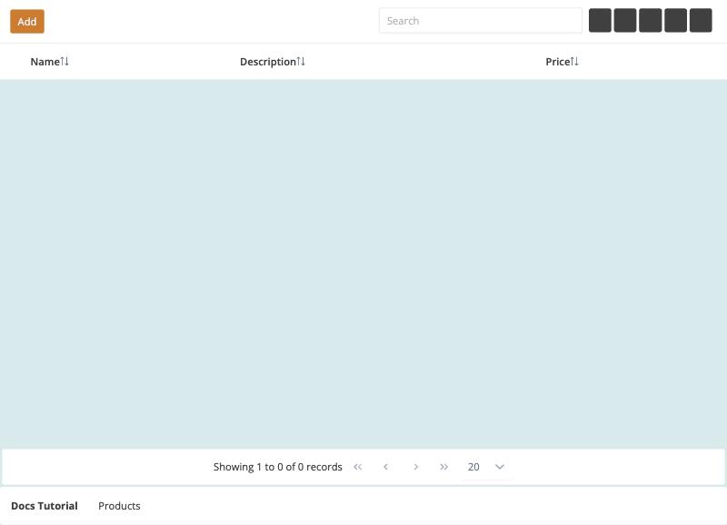
The generated style sheet contains the rule .button-status-primary button { background-color: #d97706; }. To use a colour that you also need elsewhere, add a variable to the theme and choose it for the row, with the globe icon.
Your own CSS class
The User LESS Code tab holds your own style rules, written in LESS. It already contains the rules of the application, such as the toolbar of the master page, and can use the variables of the theme, for example @border-color.
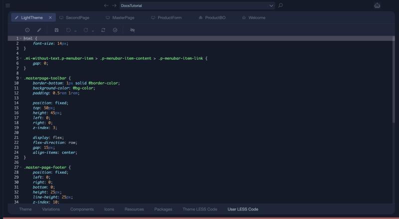
Add a class at the end, for example one that lays three items in a row:
.split-3-columns {
    display: flex;
    flex-direction: row;
    justify-content: space-between;

    .split-3-columns-item {
        width: 30%;
        padding: 10px;
        display: flex;
        flex-direction: column;
    }
}
Save the theme. Then, in a form, select a Container and type the class name, split-3-columns, in the CSS Classes box of its Style section. Put three containers inside it, each with the class split-3-columns-item, and drop a form group into each.