Theme Editor
Themes are the zAppDev models that define how your application is presented to its Users. The Theme editor is designed so that you can easily customize the user interface with a few clicks, without writing a single line of code. Precise tweaking is also possible at all levels requiring nothing more than basic style coding skills.
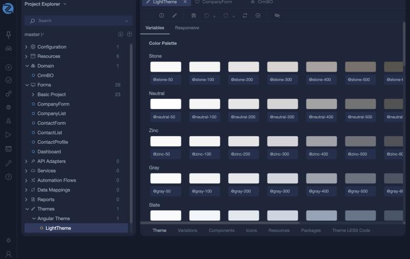
In the current Studio the editor has these tabs at the bottom: Theme (with Variables and Responsive), Variations, Components, Icons, Resources, Packages, Theme LESS Code and User LESS Code. A theme is built in tiers. Global variables hold the design tokens, such as colours and fonts. Variations override them for a context such as light or dark mode. Components style each control and reuse the variables. User LESS code is your own LESS, applied last, so it overrides everything before it.
New Theme Model
When a new zAppDev application is created it includes one or more default themes, depending on the Template used (usually a dark and a light one). You may customize the default themes or create a new one with the following ways:
- Right-click at the Themes Item of the Project Explorer and select Add
or
- Click on thebutton of the Taskbar and select Theme
Finally, add a Unique name to your new Model and click Ok
Advanced and Simple Editor Modes
When a new Theme model is created, the editor opens it in Simple Mode. This mode allows easy customization of the User Interface without the need to mess around with coding or with some more complex editor features. On the other hand, Advanced Mode exposes all these features that allow full customization of each graphical aspect of the application.
To switch from Simple to Advanced mode, just click the *LESS*icon on the editor ribbon.
To switch from Advanced to Simple mode, just click the *Paintbrush*icon on the editor ribbon.
LESS stylesheet language
When it comes to custom styling, Theme Editor uses the LESS stylesheet language. LESS is nothing more than a superset of CSS, meaning that it is 100% compatible with existing CSS code (and of course your CSS coding skills), while adding many cool features like rule nesting and variable definitions.
You can read more about LESS here.
At a Glance
Here is a list with the basic editor areas and a short description of their features :
| Section | Description | Available in Simple Mode |
|---|---|---|
| Theme and Variations | The colour palette, the global variables, the screen breakpoints, and the fonts and variables of each variation | YES |
| Icons | Manage your app icons | YES |
| Components | Allows customization of each Form Component separately | YES |
| Resources | Import resources like stylesheets, scripts and fonts | NO |
| Theme LESS Code | Allows editing of the LESS Code that is used by the Theme | NO |
| User LESS Code | Allows customization through custom LESS Code | YES |