Form Editor
Any Web Application that contains a User Interface, has forms. All Forms in zAppDev can be designed using the Form Editor.
The Form Editor contains everything required to create a fully-functional, responsive and comprehensive form filled with
- Components
- Database Data
- Calculated Data
- Validations
- Operations and Functionality
- Events and Handlers
- Graphics
- Sub-forms (Modals, Partials, Forms within Forms)
- ... and more
Form Types
When creating a Form in zAppDev, you must choose its type. The type determines the role the form plays within the application. There are three available types:
| Type | Description |
|---|---|
| Normal Form | A fully autonomous, navigable page of the application. Always rendered inside a Master Page. |
| Master Page | A layout wrapper that defines the shared shell (menu, header, footer) surrounding Normal Forms. Not a standalone page. |
| Partial View | A reusable UI fragment embedded inside other forms. Has no route of its own. |
New form
There are several ways to create a new form, depending on what you want to create and for which purpose. Click the New button of the Taskbar, or right-click the Forms folder of the Project Explorer and choose Add..., and select the Form category. Studio offers six templates:
| Template | Creates |
|---|---|
| Empty Form | A blank canvas |
| Data Entry and List Form | A combined view and edit, made from a class (see Hello World, part two) |
| Data Entry Form | A form to create and edit records |
| List Form | A table to browse records |
| Master Page | A shared layout shell |
| Partial View | A reusable form fragment |
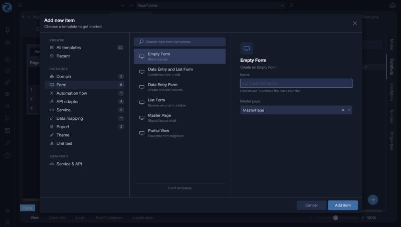
To create an empty form:
- Select Empty Form
- Choose a unique name for your form, in PascalCase
- Select the Master Page that the form should use as its layout
- Click on Add item
The Editor
The Form Editor consists mainly of:
- The View Tab: This is the actual UI Editor for your Form, where you can drop Components from your Toolbox, set their positions, define their properties and more
- The Controller Tab: In this tab you can add and define the actual functionality of your Form, in terms of Controller Actions
- The Logic Tab: The Logic Tab can be used to define the visible logic of your form, in terms of Validations (i.e. rules and their messages), Conditional Formattings (i.e. conditionally displayed parts of your Form) and Calculated Expressions (i.e. calculated/defined values, set using any logic you want, that should be presented in your Form)
- The Property Grid containing
- The Event Listeners Tab: The tab that you can use to define the behavior of your Form, should a specific Event occur during its execution
- The Localization Tab: Translatable terms of any alphanumeric information presented and/or used by the Form
The form editor in Studio
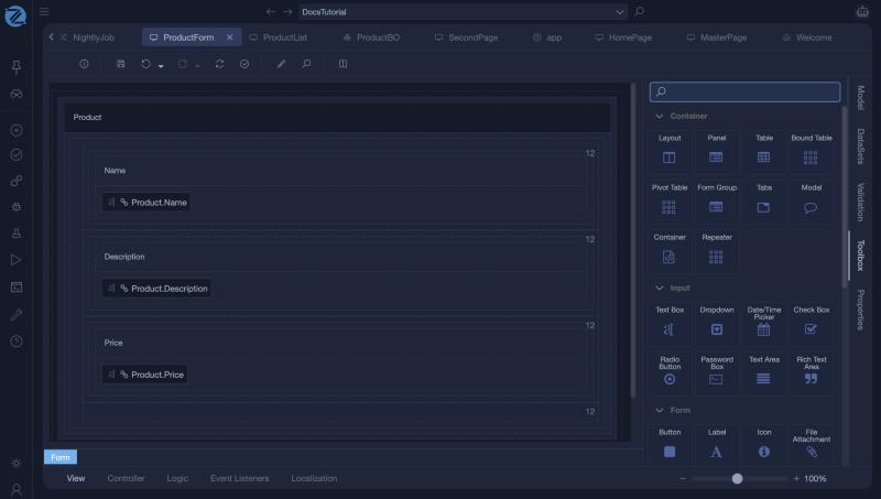
At the bottom of the editor, the tabs View, Controller, Logic, Event Listeners and Localization switch between the parts of a form. On the right, the Model, DataSets, Validation, Toolbox and Properties panels open next to the view. The zoom control is at the bottom right.