Validation
Introduction
This section explains how you can create a friendly User Interface to display validation related information.
As you probably have noticed, zAppDev validates forms via Required Fields and Data Validations
It is suggested that you first read this so that you are aware of how to create Data Validations and Conditional Formattings using Form Logic.
Triggering Form Validation
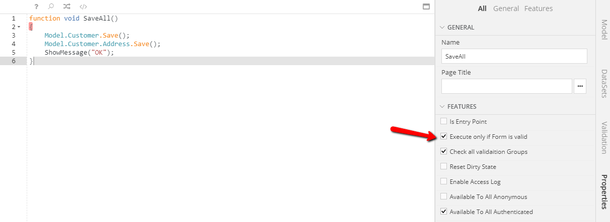
No matter how many Data Validations or Required Fields you create, Controller Actions will be executed, unless Execute only if Form is Valid is checked in Controller Action properties.
Before a Controller Action that requires a valid form is executed, all Data Validations and required fields are evaluated. By default, possible validation failures and empty required field errors will be displayed in a Validation Panel located at the bottom of your Form. Clicking a message inside this panel, will set focus to the related form control, if any.
When all required fields are completed and no data validations fail, Validation Panel is hidden and user is able to execute Controller Actions that require the form to be valid.
Data Validation at Back End
Data Validations of Error type are evaluated both client side and server side. This happens because every client is considered to be untrusted - by definition.
Validation Messages
Validation Pane
At the right hand side of Form Editor you can see the Validation pane, below DataSets. Click this pane to reveal the three main groups of validation messages
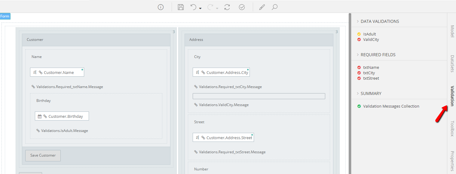
Data Validations
Every Data Validation defined in your form is contained here. You will notice that the icon on the left of the rule name matches the rule type:
- Red = Error
- Yellow = Warning
- Blue = Info
Required Fields
This group contains all fields marked as Required in your form
Summary
This group will always contain a single entry Validation Messages Collection
Creating validation message Labels
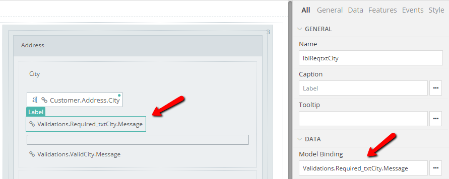
To display a validation message or (empty required field error) at any position inside your form (e.g. below the related control), just drag the corresponding entry from the groups stated above and drop it to the desired position. This will create a Label control bound to this validation message. You may add any styling and roles to this label to create a UI according to your preferences.
Auto hide
Labels bound to Validations that have not been triggered or bound to non-empty Required Fields will be automatically hidden. At the moment a validation is triggered, or a required field becomes empty bound label(s) will become visible.
Defining Validation Message Content
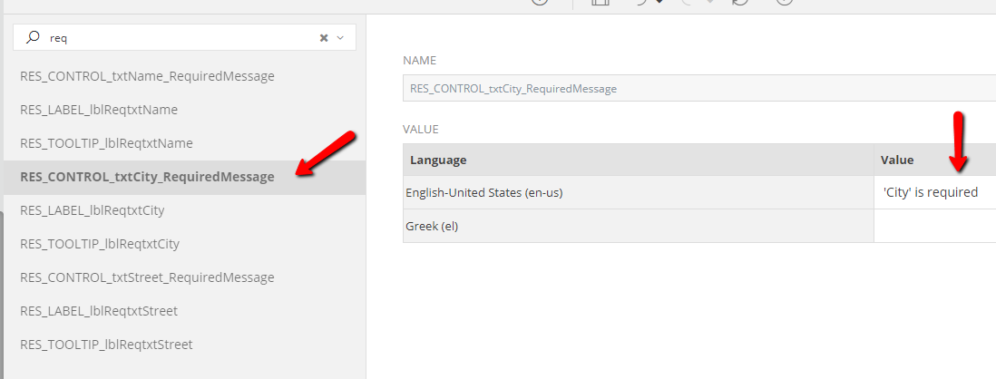
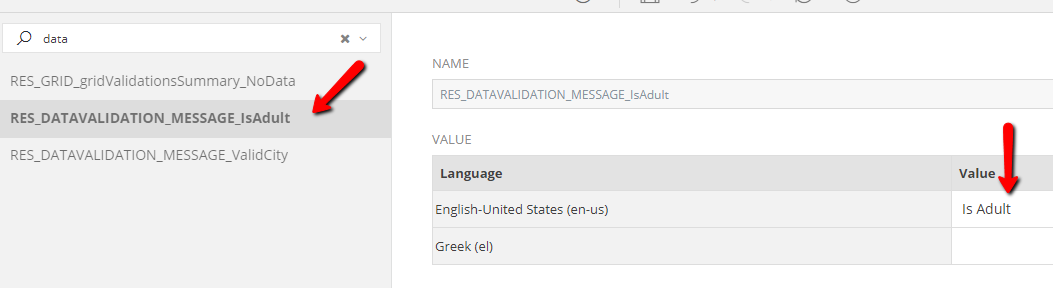
The actual text content displayed in Labels bound to Validations or Required Field errors can be set in Form Localization. The resources follow the naming conventions below:
| Message | Convention | Example |
|---|---|---|
| Required Field | RES_CONTROL_{CONTROL NAME}_RequiredMessage | RES_CONTROL_txtName_RequiredMessage |
| Data Validation | RES_DATAVALIDATION_MESSAGE_{RULE NAME} | RES_DATAVALIDATION_MESSAGE_IsAdult |
Conditionally Required Fields
In case your form contains a field that becomes Required under a specific condition, there will be no related text resource under Localization. Just create a new one by following the convention above.
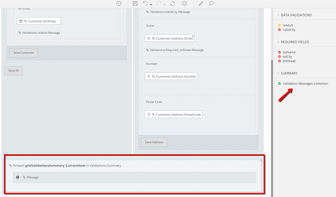
Custom Validation Summary
As mentioned earlier, every form contains a built-in validation message summary panel that will fit most use cases. To display Validation Summary in a customized way you may create a Bound Table control by dragging the
Validation Messages Collection (located under Validation -> Summary) to the desired position.
This process will create a Bound Table with a single row containing an Icon control and Label bound to the validation's message. It goes without saying that any combination of controls and styling is possible for customizing the UI to match your personal taste.
Auto Refresh
A Bound Table bound to Validation Messages Collection will automatically refresh its content (e.g. add / remove rows) according to the validation state of your form.
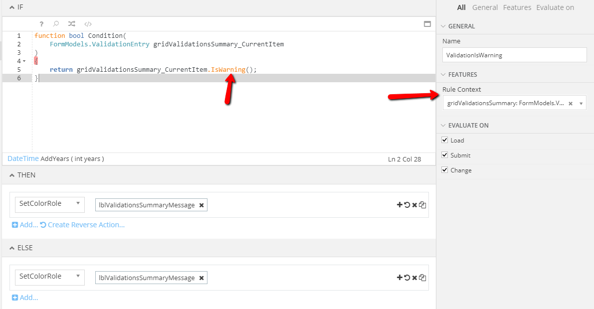
Conditional Formattings on Validation Message Summary
A very common task is applying styling rules on each row of a Bound Table bound to Validation Messages Collection, based on the type of each validation (error, info, warning). To do so follow these steps:
- Create a new
Conditional Formatting - Select the validation summary Bound Table as
Rule Context - Check current
Validation Entryusing the built-inIsError(),IsInfo(),IsWarning()functions - Set the desired actions (e.g. Change Color Role)
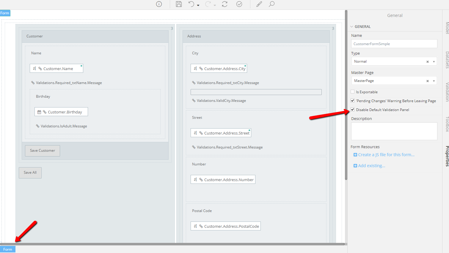
Disable Default Validation Panel
When creating a Custom Validation Summary, it is suggested that you disable the default buil-in panel. This can be done by selecting the Form root element from View (the breadcrumb below is usefull here) and checking the Disable Default Validation Panel checkbox under Properties.
Validation Groups
Validation Groups allow you to partially evaluate a Form before executing a Controller Action. As an example, think of a wizard-like UI where every step must be validated independently. There is no need for the fields in Step-2 to be valid in order to "submit" Step-1. To achieve this functionality you have to create some Validation Groups.
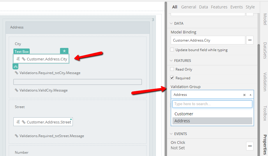
Creating a Validation Group
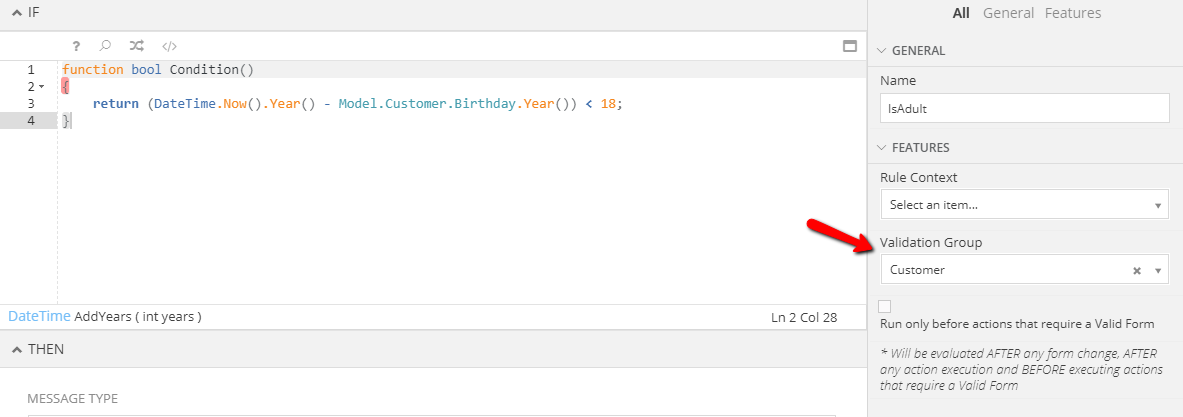
Validation Groups are created in two ways, by selecting a required field in Form View or by selecting a Data Validation in Form Logic. Open its properties, locate Validation Group property under Features section and type-in the name of the Validation Group you want to create.
To assign an existing Validation Group to a required field or Data Validation use the same process, but instead of typing jut select one of the available groups.
Assigning Validation Groups
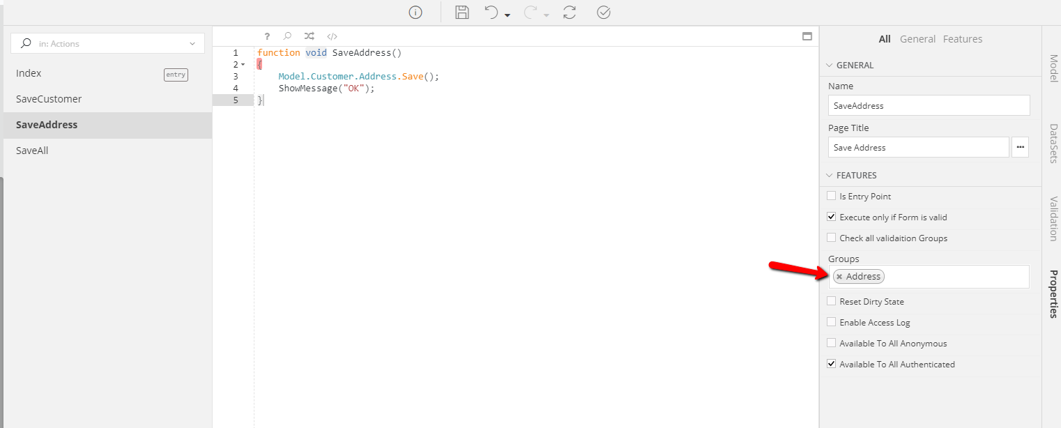
The last step required is to match Validation Groups to Controller Actions. By default, an action will not require the Form to be Valid. Notice that by checking the Execute only if Form is Valid checkbox, another checked checkbox appears: Check all Validation Groups. This means that this action requires that the form is valid as whole before being executed.
To change this, uncheck the Check all Validation Groups and select one or more Validation Groups from the newly appeared property named Groups. By doing so, this action will only evaluate data validations and required fields that belong to the selected groups before proceeding to execution.
Validation Styling
All styling related to Validations can be configured using zAppDev's Theme Editor. There are a lot of predefined style semantics to tweak but you are able to create your custom rules too, just like for every other UI element of your application.
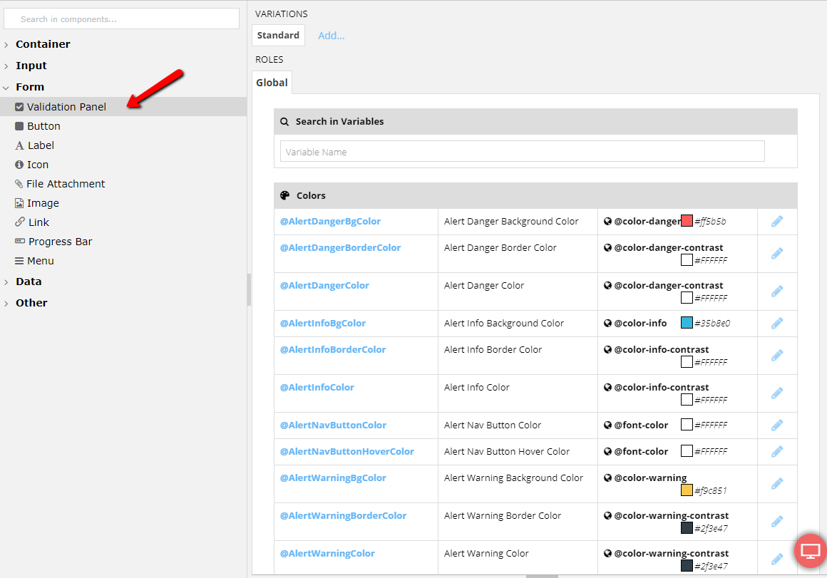
Validation Panel
To play around with the Default Validation Panel, locate Validation Panel under Form in Components tab. You will be presented with a lot of high level styling properties that will enable you to precisely stylize the default validation panel.
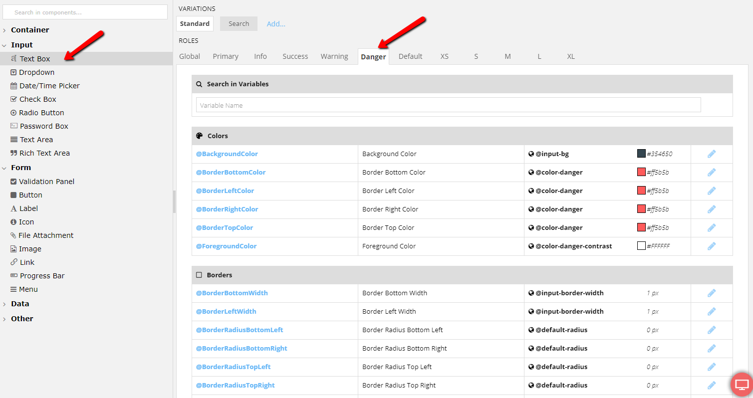
Control Roles
When a required field is left empty or a control's related Data Validation is triggered, the client side framework will auto-change its Color Role. Empty required fields are assigned the Danger role and controls related to Data Validation are assigned the role that matches its type. In detail:
| Type | Role |
|---|---|
| Empty Required Field | Danger |
| Data Validation Error | Danger |
| Data Validation Warning | Warning |
| Data Validation Info | Info |
Please refer to the Theme Editor's documentation that will guide you through the style customization of the various control Roles.