Chart
Introduction
Use this control to build a Chart for better data visualisation.
Description
Chart has a Large variety of available options and many Types. Objects of the Char are those of a selected [DataSet] . The Types of the Charts are (Pie, Doughnut, Line, Bar, Radar, Polar, Bubble, HorizontalBar). The basic attributes you need to create a simple chart through your dataset, are: -Select your Dataset throught Advanced Properties -Add an attribute for label (item label) -Add an integer (member) You have options to group by, to change style font and many other options for better data presentation.
Options
Data
| Name | Description |
|---|---|
| Dataset | You can select chart's [DataSet] |
Advanced Properties
Data
| Name | Description |
|---|---|
| Item Label | |
| Group By | |
| Aggregation Mode | |
| Column Selection Mode | |
| Member | |
| Label |
Common
| Name | Description |
|---|---|
| Ignore Theme Defined Colors | |
| Is Responsive | |
| Is Stacked | |
| Maintain Aspect Ratio | |
| Transparency Effects | |
| Tooltip Format | |
| DataSet Border Width | |
| Pallette |
Legend
| Name | Description |
|---|---|
| Visible | |
| Full Width | |
| Position | |
| Label Box Width | |
| Label Font Size | |
| Label Font Style | |
| Label Font Color | |
| Circles instead of Boxes |
Annotations
| Name | Description |
|---|---|
Scale
| Name | Description |
|---|---|
Features
| Name | Description |
|---|---|
| Type | Select Chart's Type |
| is Responsive | Chart resize depending on given size for better visualisation |
Examples
Simple Chart Creation
in this example, we create a simple pie chart showing how many tasks have been done by each employ
first you put your chart
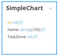
you need a [class] to create your dataset
we simply need a name and the number of tasks that have been completed
then you can create a model(UserDoneTasks) and fill it with items
Domain.SimpleChart usertaskdone = Domain.SimpleChart.Create();
usertaskdone.Name = "Joe";
usertaskdone.TaskDone = 6;
users.Add(usertaskdone);
you bind your dataset
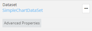
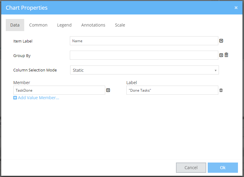
and throught the advanced properties, you select the name for the item label and the task as member
Result
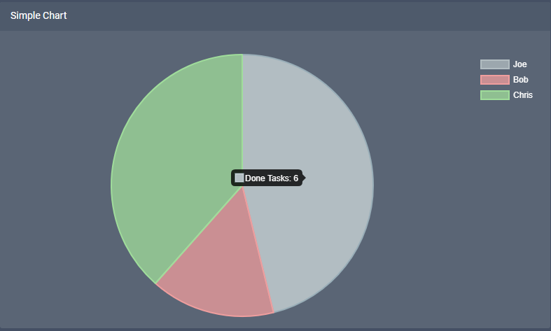
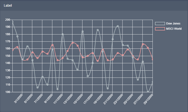
Chart whith more than one members
in this example, we will create a line chart with two stocks and how the value ranges every day of a month
our will have one more integer
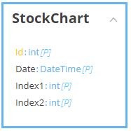
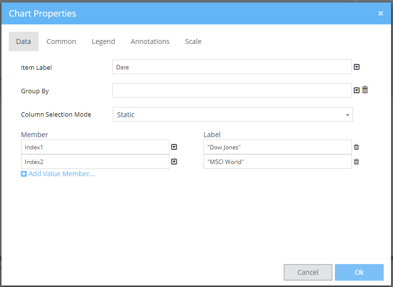
after the dataset creation and selection, you go to advanced properties and select the date for the item label and the indexies as members
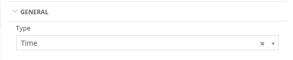
you can change the format of the axies through scale, so the X axies is Time and y is linear,
Result