Data List
Introduction
Use this control to build a List with row and collumns capable of representing, managing, filtering and Categorising Data.
Description
Data List has a Large variety of available options. Objects of the list are those of the selected [DataSet]each row represent an object and each column an attribute, by selecting a dataset it auto populate the list by adding all the object and creating columns for every primitive attribute, you can add or remove columns. You can insert Buttons that are visible either always or by selecting one or several objects, you can group several attributes, and you can have the sum, average or the total count of a specific attribute.
Options
On Data List
Data
| Name | Description |
|---|---|
| Dataset | You can select list's [DataSet] |
| On Update | You can select on of the three options below to be activated on any update of data on the list |
| On List Import | You can select a controller action to be activated for each imported item |
| On Start Fetch Dataset | You can select a controller action to be activated befor fetching Dataset |
| On Finish Fetch Dataset | You can select a controller action to be activated after fetching Dataset |
| Post Process Action | You can select a controller action to be activated after |
| Limit Number of Selected Rows | You can limit the maximum number of selected items |
Features
| Name | Description |
|---|---|
| Stand Alone | Makes the list resizable so when centered it can take full height |
| Include Numberring | Include Nuberring of the list objects in front of every row |
| Export | Export data of the list many otions included |
| Import | Import data on the list |
| Allow multiple selection | allow you to select more than one object |
| Searchable | Allow search on list attributes |
| Grouping | Allow user to add and manage grouping |
| Structure Filtering | Allow you to add filters |
| User Views | User can save list preferences |
| Resizable Columns | Allow you to abjust the size of columns |
| Show/Hide Columns | Enable show/hide for each column |
| Reorder Columns | Allow you to change columns order |
| Display Records Info Row | Display the shown record numbers and the number of selected rows |
| Wait For Predefined Filters | List loads after after filters have been loaded |
| Include Alternate Rows Style | changes every second row for better visualization |
| Remember Last State | Keep the last preferences |
| Remember Selected Items | When ruturning to the list the previous selected items are already selected |
| Has Paging | Put pages on the list so fewer data will be displayed |
| User Can Select Page Size | You can select number of data per page |
On column
Features
| Name | Description |
|---|---|
| Format String | Changes format for the selected column |
| Item Type | Changes item type for the selected column |
| Column Width | Changes width for the selected column |
| Searchable | Allow the column to be included on searches |
| Has Predefined Filter | |
| Visible | Make the column visible by default |
| Editable | Allow you to edit items for the selected column |
| Importable | Allow you to import items of the selected column |
| ## Examples |
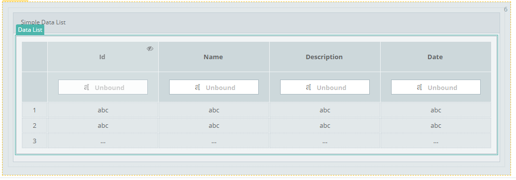
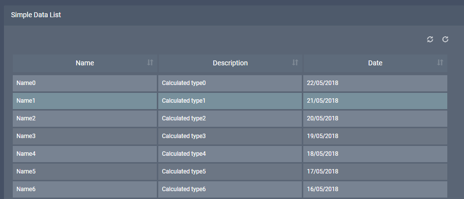
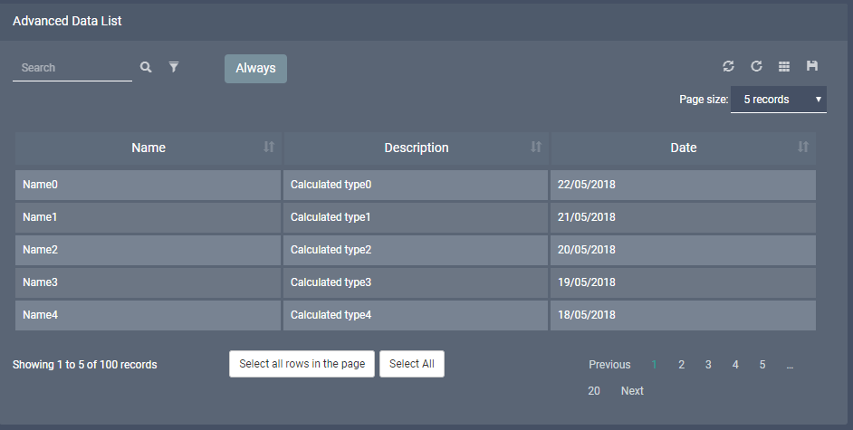
Simple Data List
Result
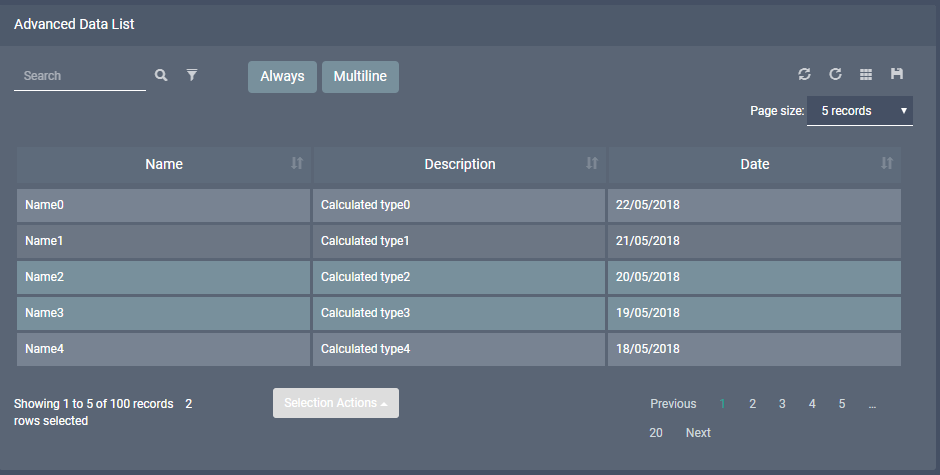
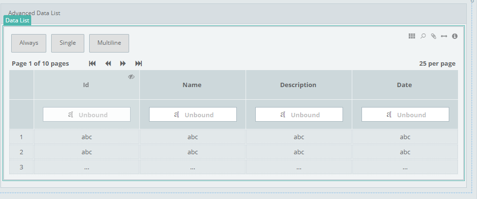
Advances Data List
Three buttons have been added, each has one of three available actions selected
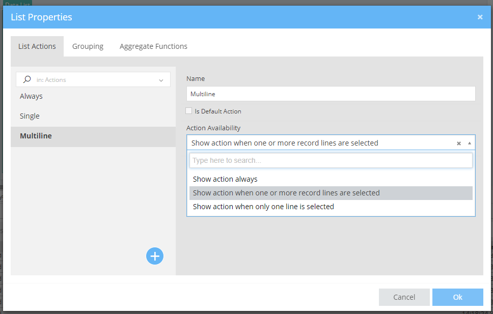
you can also have custom [Conditional Formatings] on buttons
Result
When there is no selected item buttons "Single" and "Multiline" buttons are hiden
When there is only one selected item buttons none of the buttons is hiden
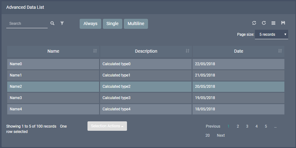
When there are more than one selected items "Single" button is hiden