Text Box
Introduction
Use this control to add an input field that can be used to display or edit text.
Description
You can select the model binding of your Text box and the option to Update binding while typing (with a specific delay or zero). The Text box may display a placeholder (appears when is empty) and a Tooltip text (appears on hover).
Options
Features
| Name | Description |
|---|---|
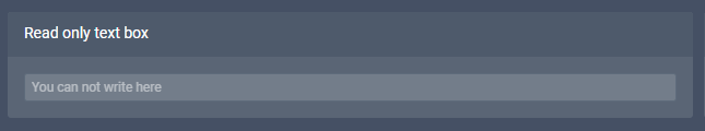
| Read Only | Text box is not editable |
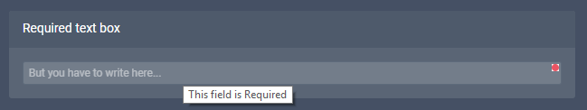
| Required | If the Text box is empty the Form is not valid |
| Does Not Make Form Dirty | Does not enable the Make Dirty indicator |
| Mask String | Converts input to a specific format |
| Max Length | Defines the max length of characters |
Examples
Read Only Text box with a placeholder text.
Required Text box with placeholder and tooltip text.