Panel
Introduction
Use this control to build a container as main field with a header and footer option.
Description
You can select if you want to have a header also you can put a footer. You can make the panel collapsible to hide the main field from header to footer if they exist, you have the option to have it begin as collapsed, on the generated application expanding and collapsing a pane can be accomplished through a button on the right side of the header, you can also the whole header the collapsing button.
Options
Features
| Name | Description |
|---|---|
| Has Header | Place header above main field |
| Has Footer | Place footer below main field |
| Collapsible | Add button toggle hide and show main field |
| is Collapsed | On page start Panel is collapsed |
| Toggle Collapse / Expand on Header Click | Makes header the collapsing button |
Examples
Panel with Header, Footer and Collapsible
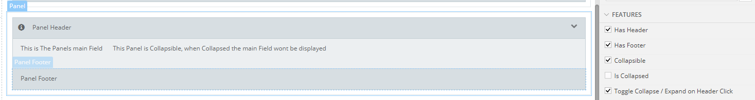
Result
Expanded
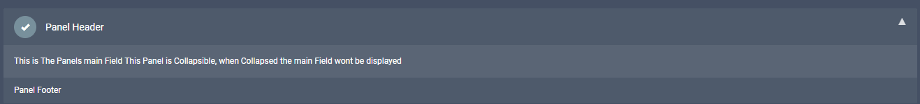
Collapsed
