Colors
By playing around with the color parameters exposed here, you are can create a global palette applied consistently to the User Interface as a whole.
Color Parameters
Color parameters are displayed side by side. Their names are self-descriptive (well, almost...) and you will instantly understand how they are applied to the Theme in case you have been exposed to any Theming UI Framework (e.g. Bootstrap).
Here is a description for most of the parameters:
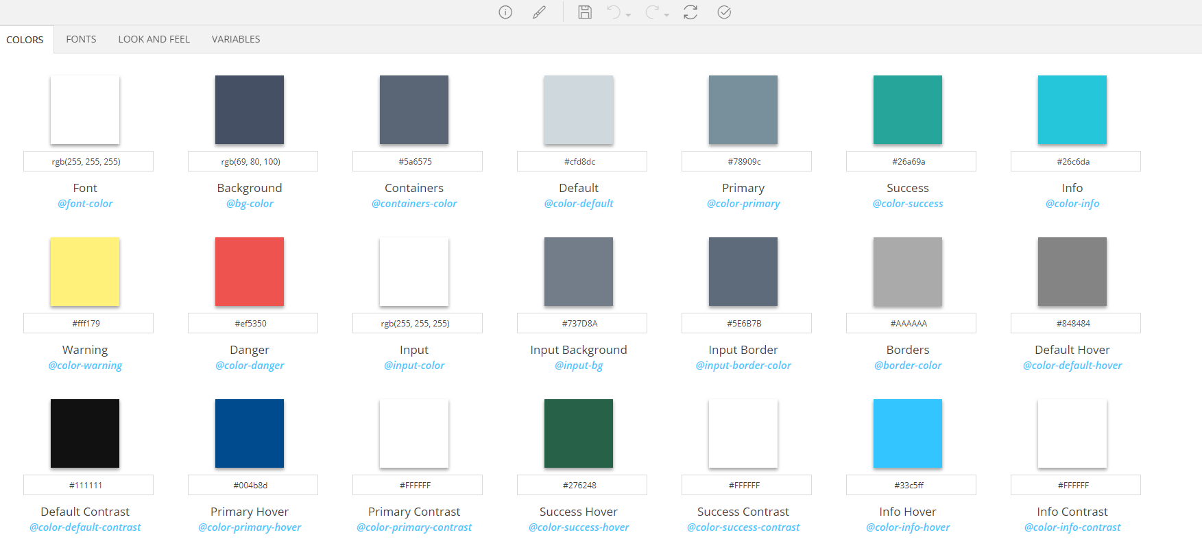
| Name | Description |
|---|---|
| Background | The background color of the pages |
| Containers | The background color of the containers (panels, modals, tabs etc.) |
| Borders | The color of the borders |
| Font | The standard font color |
| Default | The color for the elements of Default color role |
| Default Hover | The color, on hover, for the elements of Default color role |
| Default Contrast | The color that contrasts with the main color of the elements of Default color role |
| Primary | The color for the elements of Primary color role |
| Primary Hover | The color, on hover, for the elements of Primary color role |
| Primary Contrast | The color that contrasts with the main color of the elements of Primary color role |
| Success | The color for the elements of Success color role |
| Success Hover | The color, on hover, for the elements of Success color role |
| Success Contrast | The color that contrasts with the main color of the elements of Success color role |
| Info | The color for the elements of Info color role |
| Info Hover | The color, on hover, for the elements of Info color role |
| Info Contrast | The color that contrasts with the main color of the elements of Info color role |
| Warning | The color for the elements of Warning color role |
| Warning Hover | The color, on hover, for the elements of Warning color role |
| Warning Contrast | The color that contrasts with the main color of the elements of Warning color role |
| Danger | The color for the elements of Danger color role |
| Danger Hover | The color, on hover, for the elements of Danger color role |
| Danger Contrast | The color that contrasts with the main color of the elements of Danger color role |
| Input | The color used for the text of the various input controls |
| Input Background | The color used for the background of the various input controls |
| Input Border | The color used for the borders of the various input controls |
| Footers Background | The background color used for the footers of the various table-like controls |
| Footers | The text color used for the footers of the various table-like controls |
| Rows Background | The background color used for the rows of the various table-like controls |
| Rows | The text color used for the rows of the various table-like controls |
| Rows Alternative Background | The background color used for the alternative rows of the various table-like controls |
| Rows Alternative | The text color used for the alternative rows of the various table-like |
| Rows Hover Background | The background color used for the rows, on hover, of the various table-like controls |
| Rows Hover | The text color used for the rows, on hover of the various table-like controls |
| Header Background | The background color used for the headers of the various table-like controls |
| Header | The text color used for the headers of the various table-like controls |
Adjusting a color variable
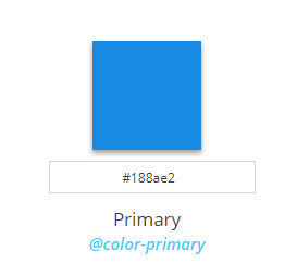
Color parameter parts
- A rectangle filled with the actual selected color
- An input box for the color code
- Its name
- The LESS variable name that corresponds to this color parameter (e.g. color-primary)
Note
The LESS variable name is hidden when Theme Editor is in Simple Mode
Changing the color
- Directly type a value to the input box. Values can be in hex, rgb or rgba format
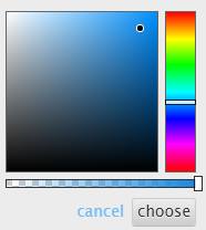
- Click on the rectangle, select the desired color using the color picker and click the choose button