Look and Feel
Tweak the Look and Feel parameters exposed here, to create a unique visual style that is applied consistently to the User Interface as a whole.
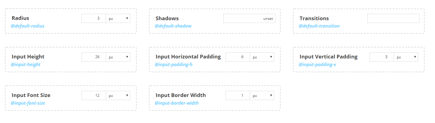
Here is a description of the Look and Feel parameters:
| Name | Description |
|---|---|
| Input Height | The height of the various input elements |
| Input Horizontal Padding | The Left and Right Padding of the various input elements |
| Input Vertical Padding | The Top and Bottom Padding of the various input elements |
| Input Font Size | The size of the text displayed on the various input elements |
| Input Border Width | The border width of the various input elements |
| Radius | The radius of the corners that is applied to many UI elements (containers, buttons, inputs etc.) |
| Shadows | The shadow that is applied to many UI elements (containers, buttons, inputs etc.) |
| Transitions | The transition that is applied to many UI elements (containers, buttons, inputs etc.) |
Warning
Shadows parameter must be set to a valid CSS box-shadow value.
It is suggested that you read the CSS Box Shadow reference from W3 Schools here.
Warning
Transitions parameter must be set to a valid CSS transition value.
It is suggested that you read the CSS Transitions reference from W3 Schools here.
Adjusting a Look and Feel variable

The LESS variable that corresponds to the Look and Feel parameter, is displayed on the left part of the parameter box, below its name (e.g. @input-height).
Note
The LESS variable name is hidden when Theme Editor is in Simple Mode
To set a value for a parameter, type a numeric value to the input box on the right of the parameter box and select a Unit from the dropdown.
Tip
It is suggested that you read the CSS Units reference from W3 Schools here.