Hello World, part four
This part makes the application look and behave better. You change the master page, rearrange the product form, add a modal dialog, and make a button depend on a check box. It assumes that you have done part one, part two and part three.
In this part you will:
- Change the menu and the colours of the master page
- Change the layout of the product form
- Add a modal dialog and open it from a button
- Use a conditional formatting to enable a button only when a check box is checked
Dark, gray or blue Studio
The theme of Studio itself is not the theme of your application. To change how Studio looks, use the Theme item of the Taskbar.
The master page
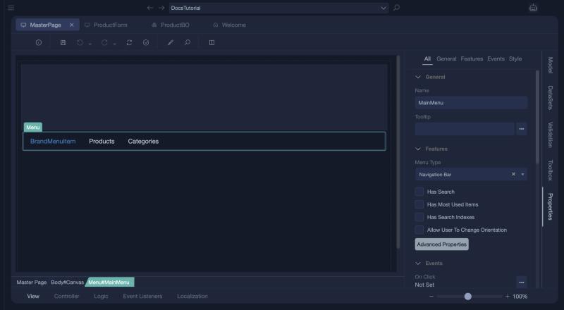
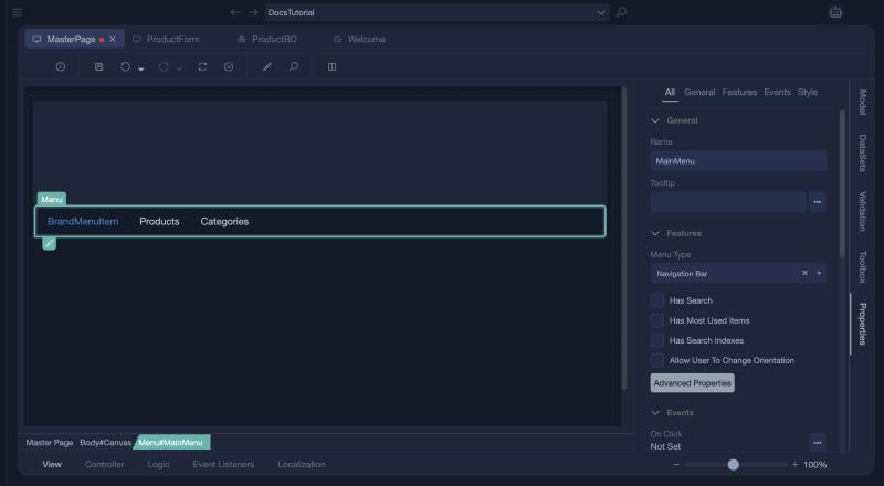
Open MasterPage. Select the menu bar and look at its Properties: the Menu Type (Navigation Bar), the options Has Search, Has Most Used Items, Has Search Indexes and Allow User To Change Orientation, and the Advanced Properties button.
The menu items
Click Advanced Properties. The Menu Properties window lists the items of the menu. A new application has BrandMenuItem, which holds the name of the application, followed by the items you created, such as Products and Categories.
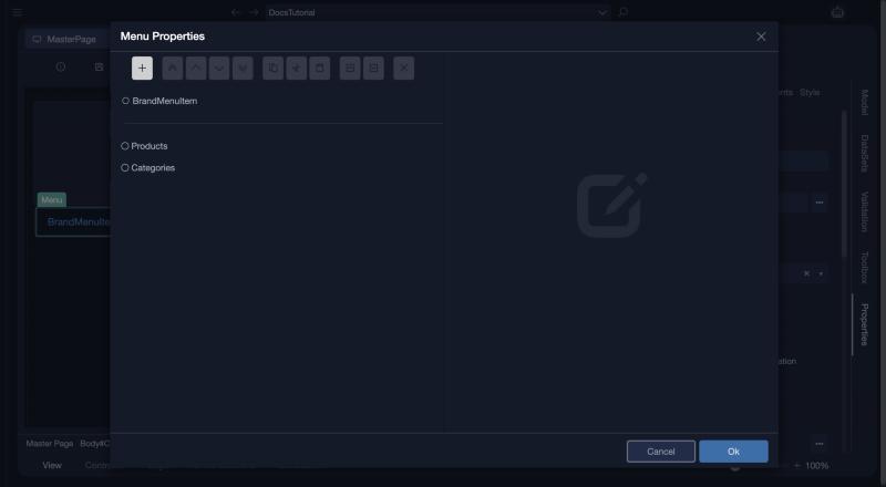
Select an item to see its properties. The brand item takes its Display Name from a global resource, RES_SITE_ApplicationTitle, and opens a web address when it is clicked. Click the ... button next to Display Name to change the text.
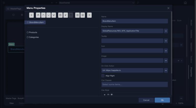
A normal item has a Name, a Display Name from the local resources (for example RES_MainMenu_MENU_ITEM_Products, so that it can be translated), a Tooltip, an Icon, an Image, an On Click Action (here ProductList: Index), Align Right, Css Classes and a Css Style.
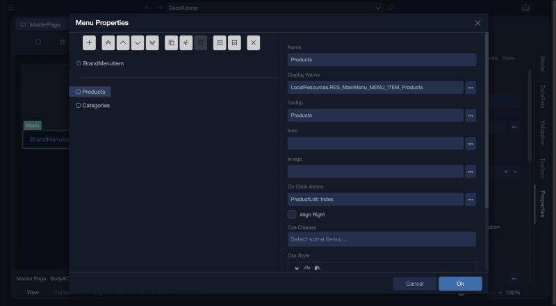
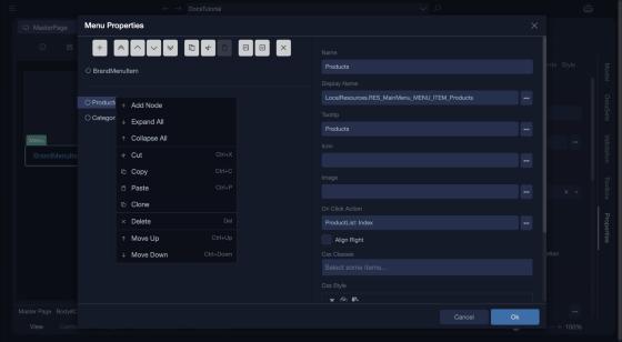
The buttons above the list add an item, move it, copy, cut and paste it, collapse and expand the tree, and delete the item. To make an item a folder, right-click its parent and choose Add Node, or cut an item and paste it onto the parent. The right-click menu also has Expand All, Collapse All, Clone, Delete, Move Up and Move Down.
The colour of the menu
Select the menu and open the Style section. Color offers the roles None, Primary, Success, Info, Warning, Danger and Default.
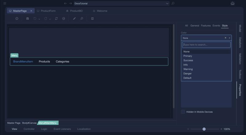
Each role is a colour that you can change for the whole application in the theme editor. For a single control, use Css Style: click inside its box and a code window opens. Type the rules without brackets, for example background-color: #39c0c3;, and click Ok.
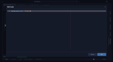
A control that has a CSS style shows a small pencil under it in the form editor.
The colour of the body
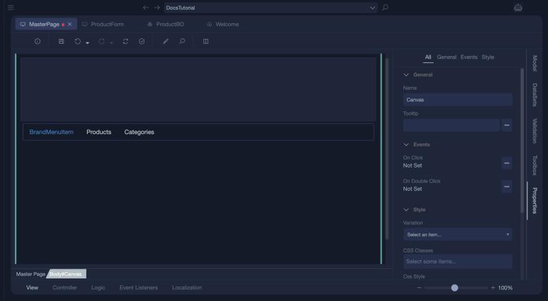
Select the body of the page, which is named Canvas, open its Style section, click inside Css Style and type background-color: #39c0c333;. The last two digits make the colour partly transparent.
Save the master page.
The product form
Open ProductForm. The wizard built it from a Panel that holds a Layout named ProductTable, and each field is a Form Group in its own row of twelve columns.
Two columns
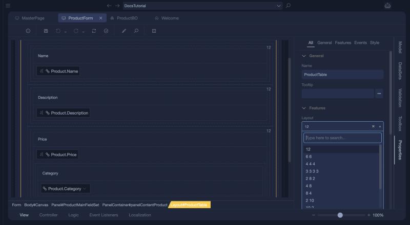
Select the layout. A quick way is to click a field, and then the Layout#ProductTable element in the breadcrumb under the form. In Properties, the Layout list starts at 12.
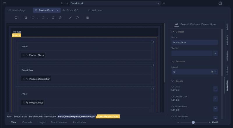
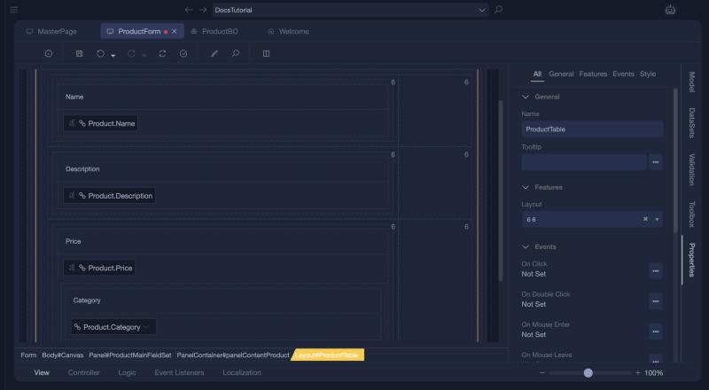
The list offers arrangements such as 6 6, 4 4 4, 3 3 3 3, 2 8 2, 4 8, 8 4, 2 10 and 10 2. Choose 6 6, so that every row has two columns.
Tip
Click an element inside the one you want, and press Esc to select its parent.
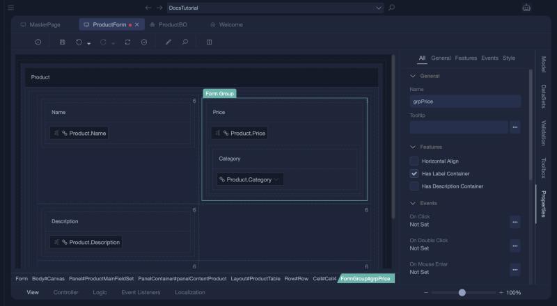
Now select the form group of Price in the breadcrumb (FormGroup#grpPrice) and drag it by its label, Form Group, to the empty column on the right of Name.
Merging columns
Select the cell of Description, either from the breadcrumb or by right-clicking its margin. Its menu has Cut, Copy, Paste, Delete, Save as Snippet, Move Right, Merge With The Right Column, Select Row, and Split Into Two Column Left and Right. Choose Merge With The Right Column, and the description takes the whole row.
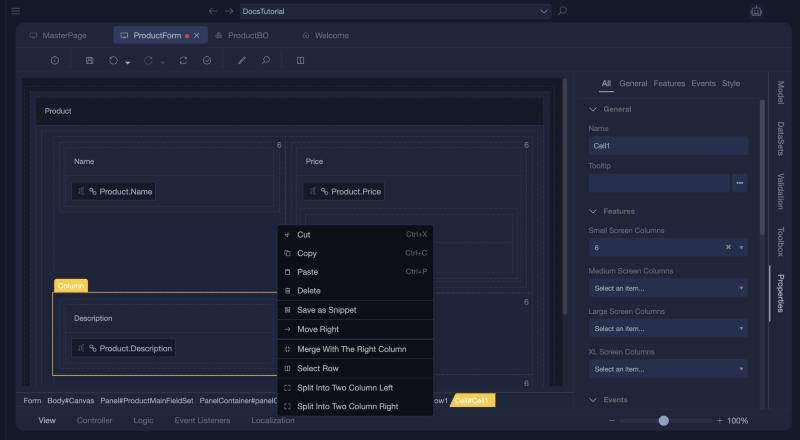
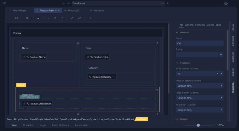
The cell on the right offers Move Left and Merge With The Left Column instead.
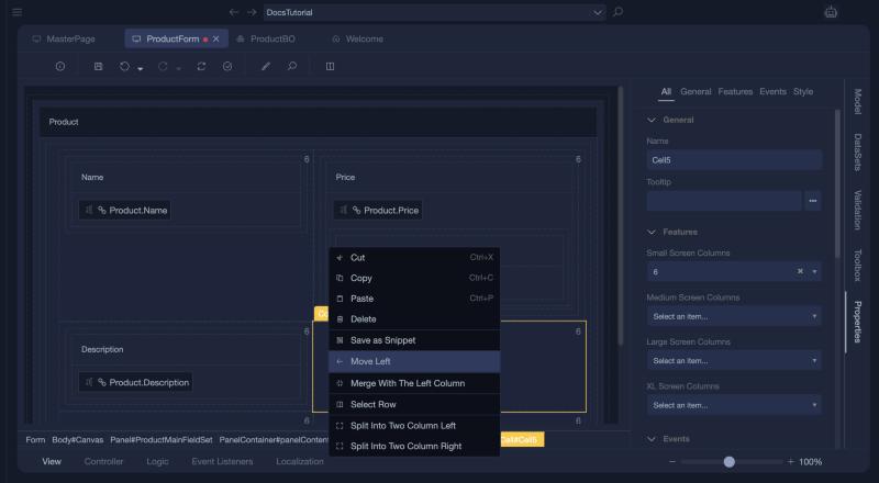
In the properties of a cell you see its columns for small screens (12 after the merge), medium, large and extra large screens. See Layout.
A modal dialog
A modal is a window that opens over the page. Open SecondPage, and from the Toolbox drag a Check Box and a Modal onto it.
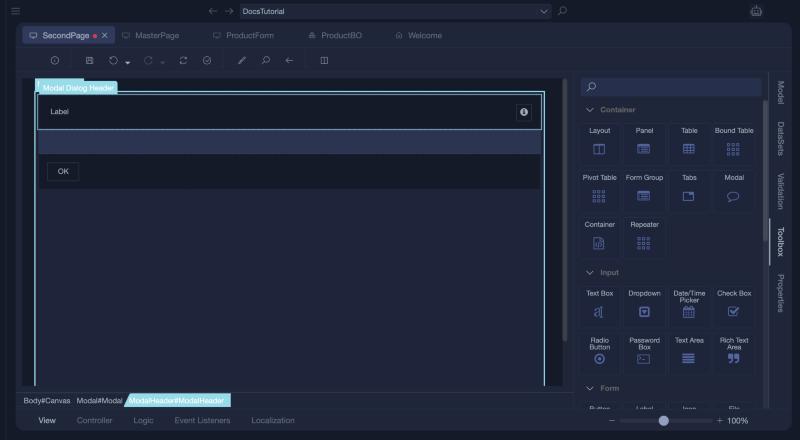
On the form the modal appears as a bar called Modal Dialog. You cannot drop controls into it from here, because it is only a placeholder. At runtime it is not shown at that place: it opens over the page wherever it is on the form.
To edit it, double-click it. Studio shows a short hint, Press this to go back. In this view you see its header, its container and its footer, which has an OK button. The header has an icon that already hides the modal. Use the back arrow at the top of the editor to return to the form.
Open it from a button
Drag a Button onto the page and select it. In Properties, click the ... button of On Click. The window Event On Click of control Button1 opens. Action Type is Form Controller Action by default, and the list offers many more, such as Close, Apply Data Set Filters and Sort Data Set.
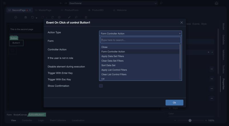
Search for Modal and choose Show Modal, then choose the Modal Control and click Ok. The button now shows On Click: Show Modal: Modal.
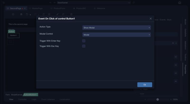
You can reach the same result with a controller action that calls FormControls.Modal.Show();, and choose that action for the click.
Enable a button with a check box
A value for the check box
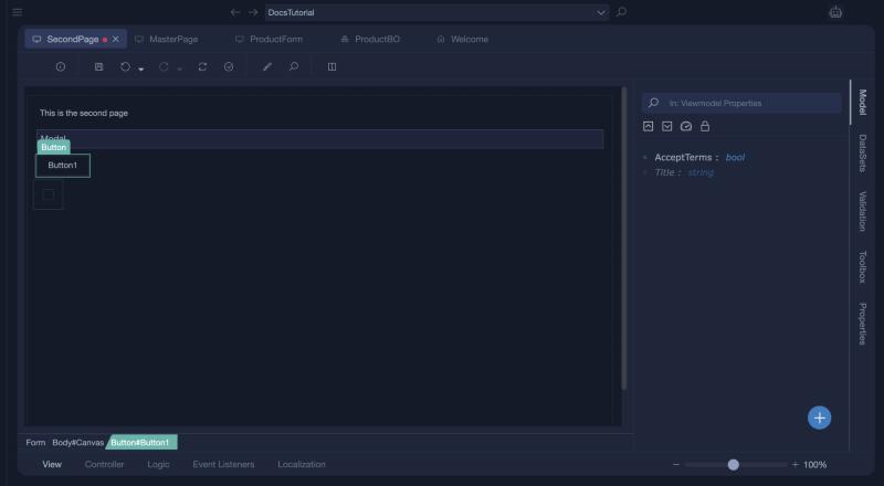
In the Model panel, click + and choose New Interface Property. Name it AcceptTerms and choose the type bool. An interface property belongs to the view model of the form, not to a business object.
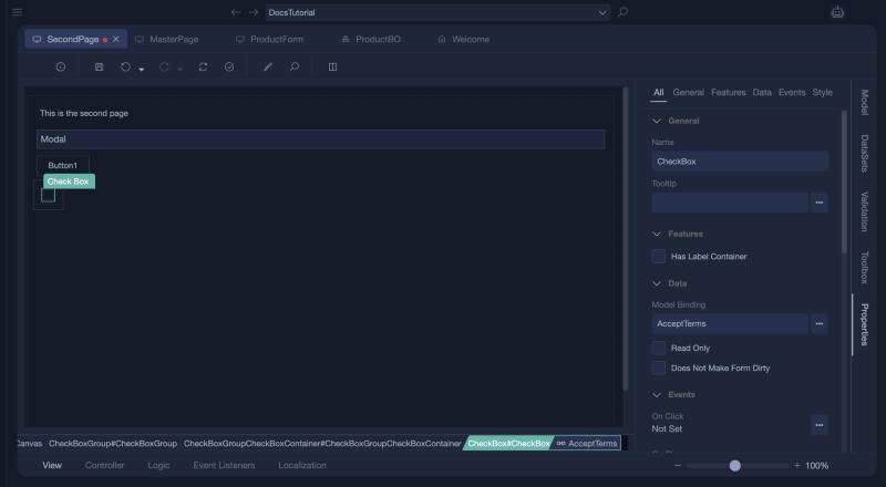
Select the check box itself (not its group) and click the ... button of Model Binding. Its properties are Has Label Container, Model Binding, Read Only and Does Not Make Form Dirty. Choose AcceptTerms.
The rule
Open the Logic tab, click + and choose New Conditional Formatting. In its code window, write:
Under Then, choose the action Enable. Click +, which opens the Select Controls window, and click the button in the picture, on its edge. The name Button1 appears in the list on the left. Click Ok.
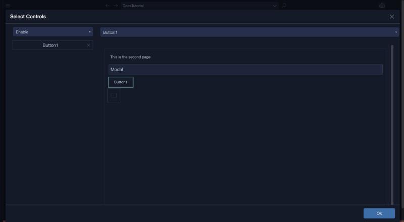
Select the button, not its label
A button holds a label. If you click the text, Label2 is chosen, and validation warns that the formatting contains action with no controls assigned. Choosing the button in the list at the top does not assign it either: it must appear in the list on the left.
Click Create Reverse Action.... Studio creates the Else part with the opposite action, Disable. It starts with no controls, so click + again and choose the button the same way. Confirm the question about the existing Else actions if it appears.
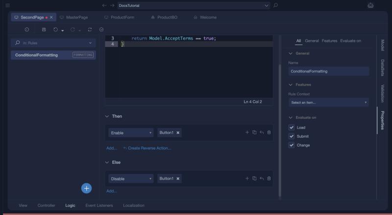
Save and validate. Studio warns that the OK button of the modal has no events. That is harmless here.
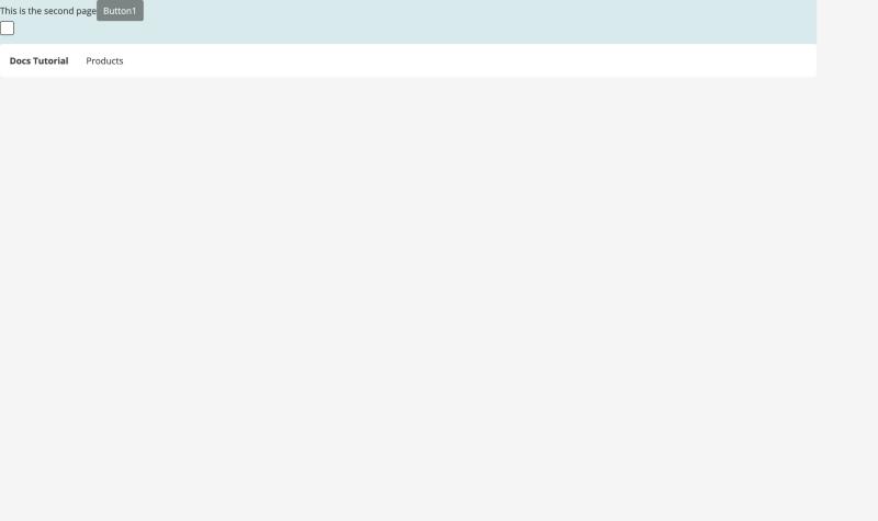
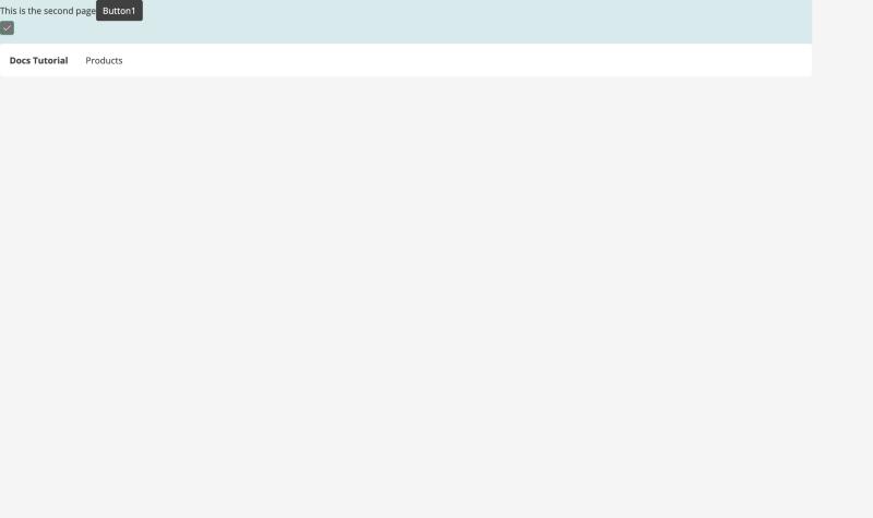
After a build, SecondPage shows the button disabled until the check box is ticked.