Container
A container is an invisible box that holds other controls and arranges them. Use it to group controls, to line them up in a row or a column, or to lay them out in a grid, and to give a group a CSS class.
Display type
The Display Type decides how the children are arranged.
| Display type | Result |
|---|---|
| Block | The children stack one under the other. This is the default. |
| Flex | The children are arranged in a row or a column, and you control spacing and alignment. |
| Grid | The children are placed in a grid. |
Flex options
These apply when the display type is Flex.
| Property | Values | What it controls |
|---|---|---|
| Flex Direction | Row, Row Reverse, Column, Column Reverse | The main direction of the children. |
| Flex Wrap | No wrap, Wrap, Wrap Reverse | Whether children move to a new line when they do not fit. |
| Justify Content | Flex Start, Flex End, Center, Space Between, Space Around, Space Evenly, Start, End, Left, Right | How the children are spread along the main direction. |
| Align Items | Stretch, Flex Start, Flex End, Center, Baseline, and others | How the children are aligned across the main direction. |
| Align Content | Flex Start, Flex End, Center, Space Between, Space Around, Space Evenly, Stretch, and others | How wrapped lines are spread. |
Example: a toolbar
A row with a title on the left and two buttons on the right:
- Add a Container and set Display Type to Flex, Flex Direction to Row and Justify Content to Space Between.
- Put a Label with the title in it.
- Add a second container with two Buttons inside the first.
Tips
- For columns on a page, a Layout with a twelve-column grid is simpler than flex.
- Give the container a CSS class and style it in the theme when the built-in options are not enough.
In Studio
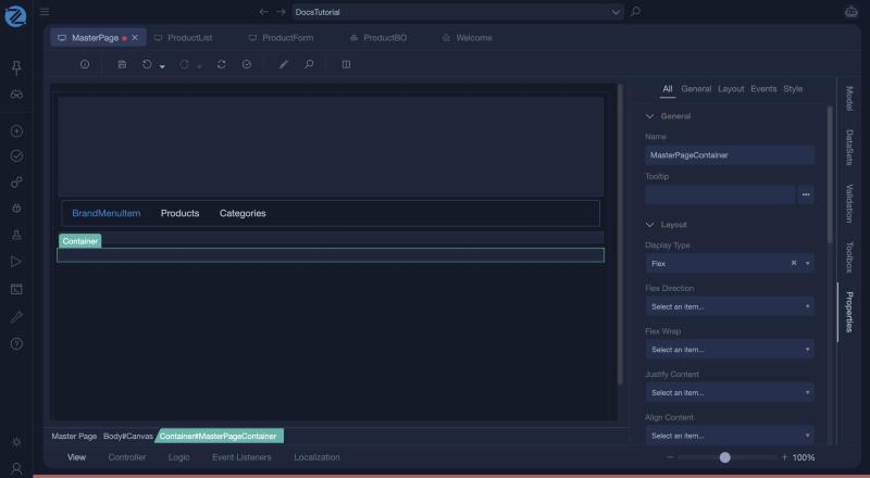
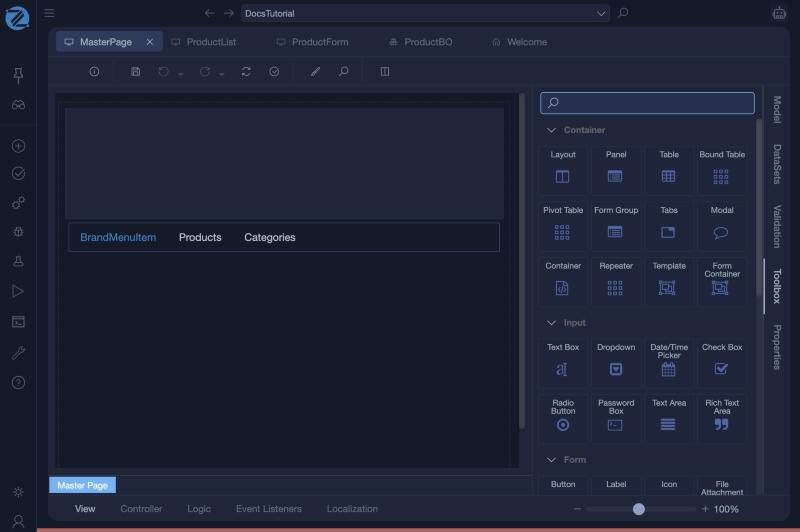
The Container is in the Container group of the Toolbox, next to Repeater, Template and Form Container.
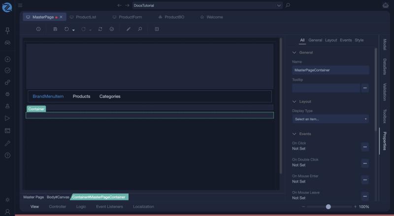
A new container has the properties Name, Tooltip, Display Type, the events (On Click, On Double Click, On Mouse Enter, On Mouse Leave) and the Style tab. Display Type is not set on a new container; choose Block, Flex or Grid.
With Flex chosen, the properties Flex Direction, Flex Wrap, Justify Content, Align Content and Align Items appear.